Prince Kamsi
Proposal · Senior Brand Designer (Contract)

Growy already writes
like a category leader.
The interface hasn't caught up yet.

A scoped audit of what's publicly visible, four findings with evidence ranked by effort against impact, three product surfaces re-systematised from your own numbers, the brand rules written as UI-ready standards, and a first asset set. Not a rebrand.

Prepared by
Prince Kamsi
For
Jacopo, Alessandro, Chidi
Engagement
Paid trial · 3 weeks
Basis
Public surfaces only
01 · Scope

What this is based on.

Your manifesto says the best argument wins and problems get named early. So let me name the limit of this one first.

I have not seen inside the product.

Everything here is derived from surfaces anyone can reach. I have not logged into dashboard.growy.app, seen your Figma, your tokens, or the workflow canvas as built. Any designer who tells you otherwise from the outside is guessing.

  • growy.app: home, Company Brain, Who We Are
  • The dashboard replica embedded on /company-brain, with real labels and real figures
  • Your published copy, which is the most useful brand artifact you have

So treat the findings below as a starting hypothesis with receipts, not a verdict. Session one is where they get pressure tested against the real thing, and where I'd expect at least one of the four to be wrong.

02 · The thesis

Your verbal brand is sharper
than your visual system.

"Not a chatbot. A co-worker that never drops the ball." · "Your knowledge exists. It's just stuck." · "Ego is expensive. We don't carry it."

That is confident, compressed, unmistakably yours. It is doing the work a brand is supposed to do. The product surfaces don't yet carry that same conviction. Not because the design is bad, but because the rules haven't been written down. Below are four places where the absence of a rule is visible on a page you show prospects.

That's the whole engagement in one line. Don't invent a new brand. Encode the one you already have.

03 · Findings

Four, with evidence.

F-01

Numbers are formatted two different ways on one screen.

The KPI row renders 2367 unseparated. Twelve hundred pixels below, the agent leaderboard renders 3,601 and 1,123 with separators. Same view, same data type, two rules.

What makes this worth naming rather than filing under nitpick: your marketing site already applies the rule correctly. Drive shows 4,128 docs, Pipedrive 2,940 records, Jira 1,200 tickets. The convention exists and is followed everywhere except the product surface. So this isn't a missing decision. It's a decision that isn't written anywhere a product engineer would find it, which is exactly the class of problem a token layer solves and a PDF doesn't.

Agent interactions  ·  2367   ← product · no separator
Total runs  ·  3,601   ← product · separator
Drive  ·  4,128 docs   ← marketing · correct
Pipedrive  ·  2,940 records   ← marketing · correct
Source: growy.app/company-brain · hero live map and "What the Company Brain sees today"
F-02

Four KPI cards. Four unrelated kinds of subtext.

Adjacent cards in the same row use their secondary line for four different jobs: a trend, a denominator, a workflow status, and an audience description. The eye can't build a pattern, so it reads each card separately instead of scanning the row. This is the single highest-leverage fix on the dashboard and it costs nothing but a decision.

Agent interactions  2367  → +20% (7d)  trend
Active users  23  → 32 total users  denominator
Pending approvals  2  → In review queue  status
Total courses  42  → Available to learners  audience
Source: growy.app/company-brain · KPI row
F-03

"Most Active Users" ranks people by an unlabelled number.

Jane Doe scores 66.4. John Hong, 54.0. The subtitle says "based on activity this week", which tells me the window but not the unit. Activity measured in what? There's no column header on the number and one decimal place implies a precision the reader has no way to interpret. This is a screen ranking named colleagues, where "why am I below him?" is a question a real customer will be asked by a real employee. Either the unit gets named, or the decimal goes.

Jane Doe  ·  Store manager  ·  66.4
John Hong  ·  Admin manager  ·  54.0
John Doe  ·  Sales person  ·  46.0
Source: growy.app/company-brain · "Most Active Users"
F-04

The same 15% is called two different things on one page.

This is the one I'd lead with. The Company Brain gap split appears twice on /company-brain. In the hero it reads In place 68 · Missing 17 · Conflicts 15. In Step 03, same three numbers, the third segment is Needed.

Those are not synonyms. A conflict is two sources of truth disagreeing, which is a data quality problem. Something needed is a gap against an objective, which is a roadmap item. One says your knowledge is contradicting itself; the other says your knowledge is incomplete. A prospect reading both in one scroll cannot tell which product they are being sold, and the number is identical in both, so they can't reason it out either.

F-01 through F-03 are polish. This one changes what the product appears to do.

Hero · "Live map · synced"
In place 68%  ·  Missing 17%  ·  Conflicts 15%

Step 03 · "Works toward objectives"
In place 68%  ·  Missing 17%  ·  Needed 15%
Source: growy.app/company-brain · two components, one page, same figures

One thing worth saying in your favour. I checked whether the numbers themselves hold up: the agent leaderboard sums to exactly 3,601 across all five agents, and the gap split sums to 100. The data is internally consistent. Every problem above is presentational, which is the good news, because presentation is the cheap thing to fix.

04 · Prioritised

Ranked by effort against impact.

An audit that lists everything wrong is a complaint. This is the order I'd actually work in, and the reasoning is visible so you can overrule it on day one with information I don't have.

Recommendation Why it ranks here Effort
1 Resolve Conflicts vs NeededF-04. Pick one word, apply to both components. A copy decision, not a design one, but it's the only finding that changes what a prospect thinks the product does. ~1 hour
2 One job for the KPI subtitleF-02. Every card's second line answers "better or worse?" Highest visual return per hour on the page you show prospects. Costs a decision and four strings. ~half a day
3 Number formatting as a tokenF-01. Grouping, tabular figures, zero decimals on counts. Cheap now, and it stops the same drift recurring on every surface built after this. ~half a day
4 Name the activity unitF-03. Column header, drop the decimal. Ranks below the others only because it needs a product answer first: what is that score actually counting? Blocked on you
5 Semantic surface and state scaleFoundation the four fixes above should be built on. Bigger job, lower visible return in week one, but the four fixes are patches without it. ~3 days
6 Decide where Courses sitsA KPI on the site with no product story behind it. Last because it's a positioning question for leadership, not a design task. But it affects surface priority. Session one

Items 1 to 4 are roughly two days of work and would be visible on your live marketing site inside week one. That is deliberate: I'd rather the first thing you see be small and shipped than large and pending.

05 · Applied · Surface one

The dashboard, re-systematised.

No new colours, no new logo, no new type family. Every change below comes from applying one rule consistently. This is what "amplify rather than replace" looks like in practice.

Today · reconstructed from public data
Agent interactions
2367
+20% (7d)
Active users
23
32 total users
Pending approvals
2
In review queue
Total courses
42
Available to learners
Most Active Users?
JDJane Doe
66.4
JHJohn Hong
54.0
JDJohn Doe
46.0
Proposed
Agent interactions
2,367
↑ 20% vs. prior 7d
Active users
23/32
↑ 4% vs. prior 7d
Pending approvals
2
Oldest waiting 3d
Courses live
42
↑ 3 added this month
Most active this week Agent runs
JD
Jane Doe
Store manager
66
JH
John Hong
Admin manager
54
JD
John Doe
Sales person
46

What changed, and why: every KPI subtitle now answers the same question is this getting better or worse? So the row scans in one pass instead of four. Numbers use one separator rule and tabular figures, so digits align in a column and don't jitter on refresh. "Total courses" became "Courses live", because total describes a database and live describes the business. The activity score got a column header and lost its decimal: if the unit can't be named, the precision was never real.

Palette and type are deliberately unchanged from what I can observe. The accent used here is a placeholder pending your actual tokens. I'd rather leave a gap than guess at your blue and be confidently wrong.

06 · Applied · Surface two

The node builder.

Your homepage runs a live pipeline: Understand request · Pull context from brain · Run workflow · Deliver outcome, with states Running and Queued. That's the canvas in miniature, and it's the surface where the visual language matters most, because it's the one thing a prospect watches rather than reads.

Today · reconstructed from the homepage pipeline
01Understand requestRunning
02Pull context from brainQueued
03Run workflowQueued
04Deliver outcomeQueued
Proposed
Understand request4s
Intent classified · confidence 0.94
Pull context from brainNext
5 sources · Drive, Slack, Pipedrive, Gmail, SAP
Run workflowWaiting
Quotation Agent · 12 steps
Deliver outcomeWaiting
CRM update + email to owner

What changed, and why: node type is carried by a distinct glyph, not by position in a list, so a canvas with forty nodes stays readable when nothing is in order any more. Every node gains a second line saying what it is actually operating on, because "Run workflow" tells a prospect nothing and "Quotation Agent · 12 steps" tells them the whole story. Running nodes get elapsed time rather than the word Running, since the anxious question during a demo is never is it running, it's how long has it been running. And the status chip stops being a colour-only signal, which is also the accessibility fix.

The three-word tagline under this section of your site is "Autonomously. Reliably." Elapsed time and named context are what reliable looks like when you draw it.

07 · Applied · Surface three

Courses, the surface nobody is defending.

"Total courses · 42 · Available to learners" is on your dashboard. There is no Courses page in your navigation, no Courses section in the product story, and no mention of it in the manifesto. It is either a real part of the product that the brand has abandoned, or a KPI that outlived its feature. Both are worth ten minutes in session one.

Today · inferred
Onboarding Essentials
Course
Compliance 2026
Course
Product Fundamentals
Course
Proposed · tied back to the Brain
Onboarding Essentials
Built from 14 SOPs · updated 3d ago
18 of 22 learners complete
Compliance 2026
Built from 6 policies · 2 sources conflict
7 of 22 learners complete
Product Fundamentals
Built from 9 docs · updated 1d ago
13 of 22 learners complete

What changed, and why: a course card that says only "Course" is a filing cabinet. Showing the sources it was generated from turns Courses from a bolt-on LMS into visible proof of the Company Brain, which is the thing you actually sell. The conflict flag is the same F-04 vocabulary reused here on purpose: once conflict means one specific thing, it can carry that meaning across every surface without a legend.

I could be wrong about all of this. If Courses is legacy, the right recommendation is to pull the KPI off the dashboard, and I'd rather propose that on day four than redesign something you're planning to delete.

08 · Applied brand guidelines

Rules, in the form a codebase reads.

The usual failure mode of brand work is a beautiful file that engineering never applies. I hand over the decisions in the form your codebase already consumes, so "apply the brand" becomes a merge instead of a project. Below is the shape of that handover, written as standards rather than suggestions.

Numbers

Thousands2,367
Counts0 decimals
Rates1 decimal
Figurestabular
Deltas↑ 20%

Type scale · 1.250

Display31 / 600
Heading25 / 600
Subhead20 / 500
Body16 / 400
LABEL11 / mono

Spacing · 4px base

Inside a chip4 · 8
Inside a card16 · 20
Between cards12
Between groups32
Between sections64

State · never colour alone

Positive↑ + green
Attention● + amber
Critical! + red
Neutralno mark
Contrast floorWCAG AA

Iconography

Grid24px
Stroke1.6px
Terminalsround
Node typesgeometric
Integrationsvendor mark

Vocabulary

Conflictsources disagree
Missingnot captured
Neededgap vs. goal
Livein use now
Totalavoid

That last panel is the one most brand handovers leave out, and it's the one that caused F-04. A shared word list is a brand asset. When conflict means exactly one thing, every future screen inherits the meaning for free, and nobody has to invent a synonym under deadline.

/* growy · foundation, illustrative structure */
--num-format: grouped;   /* 2,367 not 2367 */
--num-figures: tabular-nums;  /* digits align on refresh */
--num-precision-count: 0;   /* counts are integers */

/* KPI cards answer one question: better or worse? */
--kpi-subtitle-role: delta;  /* not status, not audience */
--kpi-delta-window: 7d;

/* semantic surface scale, extends what exists */
--surface-base       --surface-raised    --surface-sunken
--text-primary       --text-secondary   --text-muted
--state-positive     --state-attention  --state-critical

I've shipped this pattern before. My PulseWork system runs a semantic token layer with native light-dark() theming; a beauty commerce build I did runs a full Material 3 semantic architecture, pairing primary, container, on-primary and fixed-dim across roughly 300 lines. Both are in code, in production, and linked in the portfolio.

09 · Assets

The everyday output, from the same rules.

The role asks for decks, one-pagers and marketing graphics alongside the product work. Every line of copy below is yours, taken from your published pages. Nothing here invents a new voice, because you do not need one.
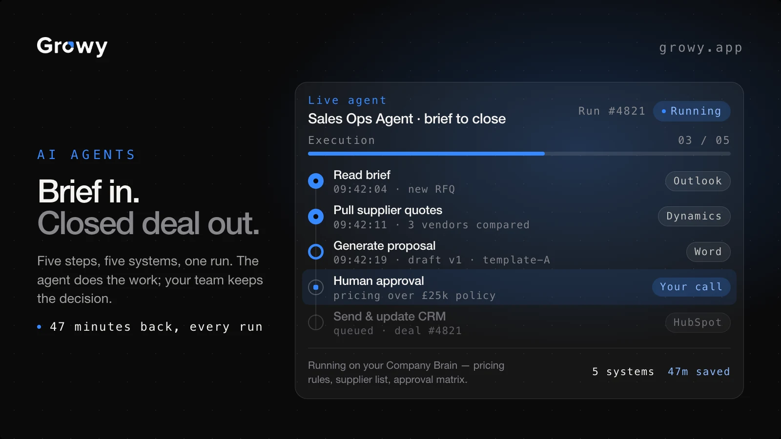
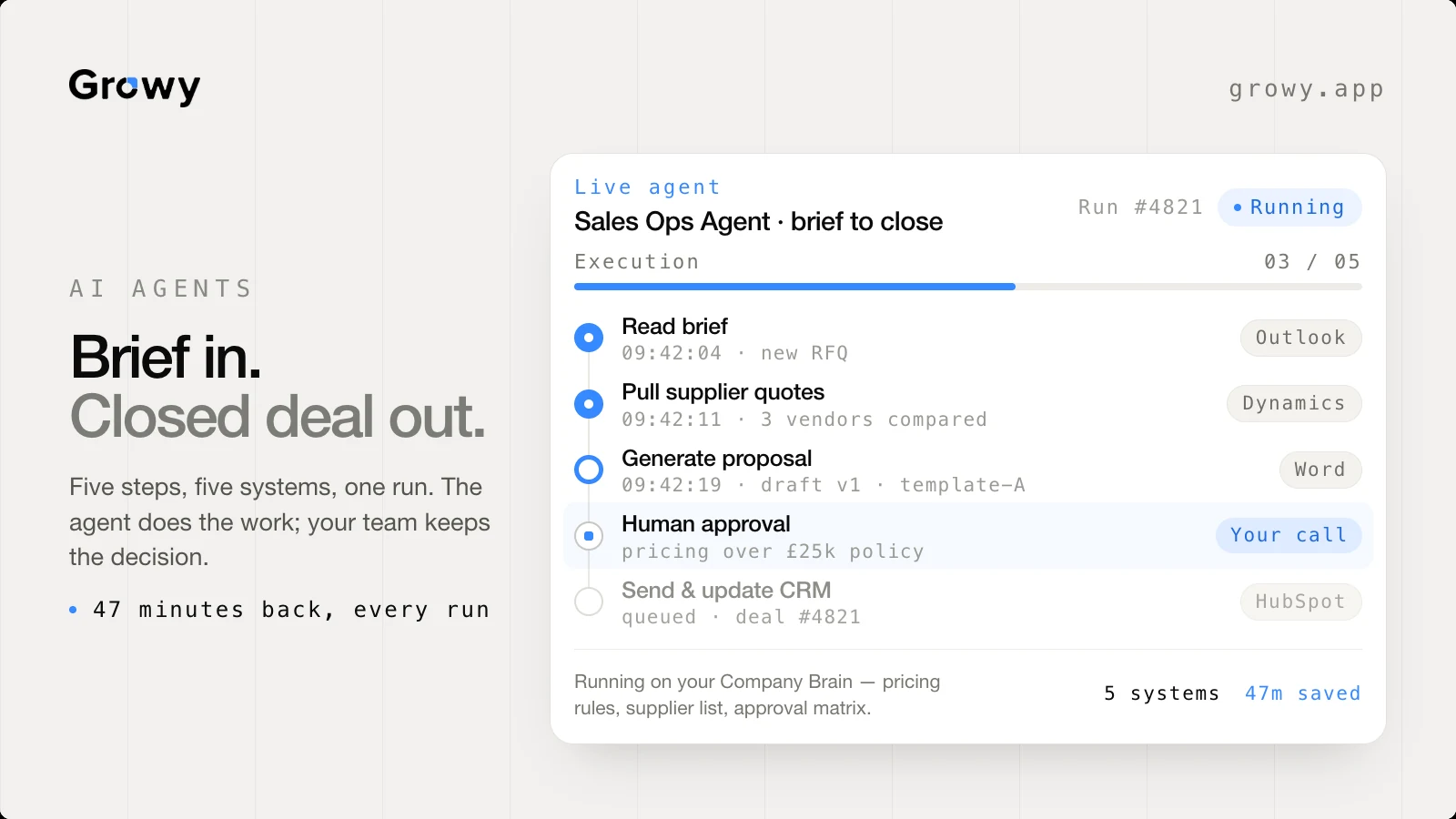
01 · Marketing graphic16 : 9 · light and dark
Growy marketing graphic, dark: Brief in. Closed deal out.
Growy marketing graphic, light: Brief in. Closed deal out.

The argument is the highlighted row. Four steps run themselves; the fifth, Human approval · Your call, is the one picked out. That is the objection every buyer has about autonomous agents, answered in the layout rather than in a sentence. The integration chips down the right do the same job for "five systems, one run" — naming Outlook, Dynamics, Word and HubSpot is more convincing than the number five.

The run itself is a constructed example, not your data. I have not seen a real execution log, and the same rule from section 01 applies here: better to say so than to imply access I do not have. Swap in a real run and nothing about the layout changes.
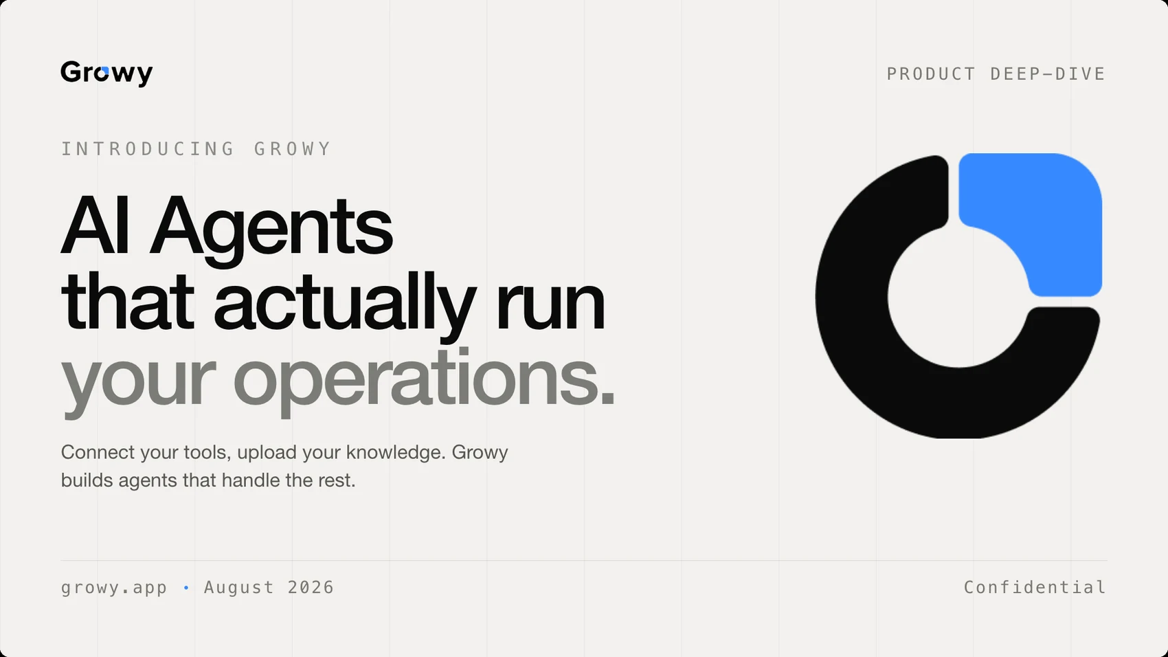
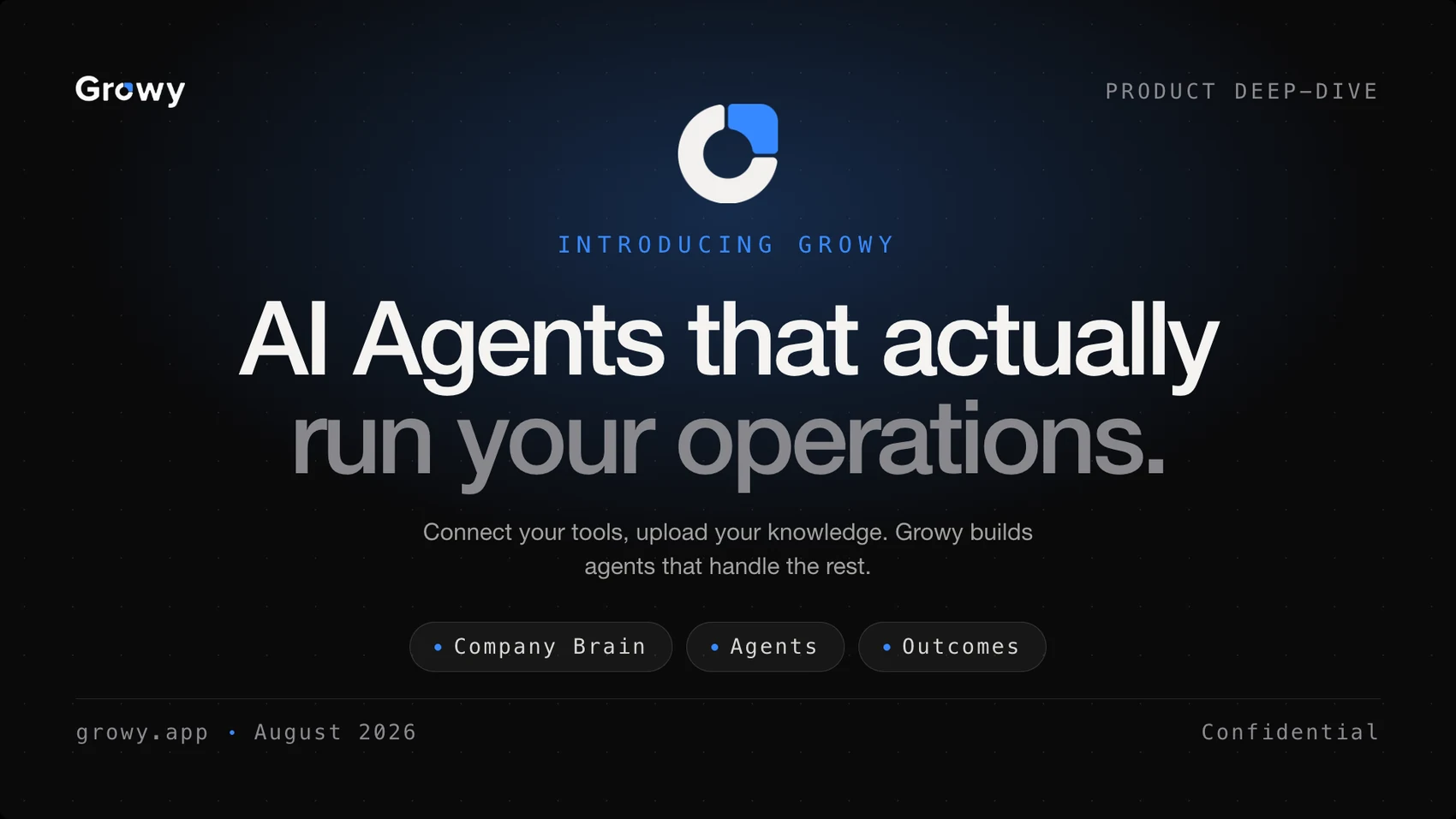
02 · Deck cover16 : 9 · title slide
Growy deck cover, light
Growy deck cover, dark

Your homepage headline, set rather than rewritten. The second line drops to grey so the sentence breaks where the meaning breaks, and the same device carries across every piece in the set. Mono holds the data — eyebrow, date, confidentiality, integration chips — and the grotesk holds the prose. Two roles, no exceptions, which is the whole of the type rule from section 08.

Light and dark are the same layout, not two designs Copy taken from growy.app

Every piece exists in both grounds because that is what makes it a system rather than an artefact. The grid, the type scale, the position of the accent and the role of the mono are fixed; only the surface changes. That is the difference between handing you four files and handing you something your team can extend on Monday without asking me.

10 · The trial

What I'd ship, and when.

Your form asks about two weeks; the role description says three. I've planned to be useful by day four and materially useful by day ten, so the third week is refinement rather than rescue.

DAYS 1 TO 4Get inside

Real access, real audit.

  • Working sessions with Jacopo, Alessandro and Chidi, separately, 30 minutes each
  • Full audit of dashboard, workflow canvas and Courses against the real build
  • Kill whichever of my four public findings the product proves wrong, and re-rank the rest
Ship: prioritised audit, ranked by effort ÷ impact
DAYS 5 TO 10Decide & apply

Tokens, then one surface proven end to end.

  • v1 token set covering type scale, spacing, semantic colour and number formatting
  • High-fidelity redesign of the dashboard, built on those tokens
  • Merged into a branch with engineering, not handed over as a file
Ship: tokens in code + dashboard live on a branch
DAYS 11 TO 15Extend

Second surface, component library, assets.

  • Workflow canvas or Courses, whichever leadership ranks higher on day 4
  • Lightweight component library so the language survives the next 20 screens
  • Applied brand guidelines + the first asset set (deck template, one-pager, social)
Ship: guidelines, components, assets
11 · Sessions

Back-to-back, and separately.

The brief asks for perception sessions with the three of you. I'd run them individually before anyone hears anyone else's answer, because a brand perception gap between founders is the most useful thing an outside designer can find in week one, and it disappears the moment you're all in the same room being agreeable.

Jacopo
30 min · Day 1

Where the product is going, and which surface is load-bearing for the next two quarters. Design priority should follow the roadmap, not the audit.

The questionIf Growy is described in one sentence eighteen months from now, which word in it does not apply today?
Alessandro
30 min · Day 1

What prospects actually say in demos. Where the interface undercuts the pitch, and which screen you find yourself apologising for.

The questionWhich screen do you skip past, and what would you need it to look like to stop skipping it?
Chidi
30 min · Day 2

What already exists in code. Whether there's a token layer, a component library, or conventions living only in review comments.

The questionIf I hand you a token file on Friday, what would stop it being merged by Monday?
All three
45 min · Day 4

I bring back where the three of you disagreed, and we settle it. That disagreement, not my audit, is what sets the design direction.

The outputA one-page direction note, agreed in the room, that the rest of the trial is measured against.

Then weekly for thirty minutes, with work in progress on screen rather than a finished presentation. Your manifesto says problems get named early; a weekly session where I show you something half-built is how that stops being a value and starts being a habit.

12 · What I'd ask you

Four questions I'd open session one with.

Transparency runs both ways. These are the things I can't answer from outside, and the answers would change what I build.

Who is the dashboard actually for?The ops lead checking anomalies, or the exec proving ROI? It currently reads like both.
Does a token layer exist today?If engineering already has one, elevation is a rename. If not, that's week one.
Where does Courses sit?It's a KPI on your marketing site but absent from the product story. Core, or legacy?
What does the canvas do that n8n doesn't?That difference is what the visual language should be dramatising.
Prince Kamsi
Brand & product design, shipped in code
Contact
princekammzy@gmail.com