VIEW
Work 01 Assets 02 Approach 03 About 04 Contact 05
Abuja, NigeriaWAT 00:00:00
Brand designer

Brands that hold their shape without me.

Anyone can make one beautiful artefact. The job is writing rules precise enough that the next fifty pieces, made by other people on a deadline, still look like the same company. That is what I design. Identity systems, guidelines, and the everyday assets that actually carry a brand.

Identities
0
Live
0
01 / Work

Four identities,
and their rules.

Each one documented far enough that somebody else could keep it consistent without asking me.

Live case study

An audit of a product I have never logged into.

Growy is a B2B AI workforce platform. Working only from surfaces anyone can reach, I found four things wrong on the page they show prospects, including the same 15% labelled Conflicts in one component and Needed in another, eighteen hundred pixels apart. Then I re-systematised three of their surfaces from their own numbers, wrote the brand rules as UI-ready standards, and built the first asset set on top.

It names its own limits in the first section. That is the part I would want a client to read.

Prioritised audit3 surfacesApplied guidelinesAssets
Read the case study
02 / Assets

The ninetieth application, not the first.

Identity work is what goes in a portfolio. Social graphics, decks and one pagers are what the brand actually spends its life as. Below is the everyday output, and one piece rebuilt to show what the system does to it.

AA feed row designed as one image

M&CTech · relaunch

Three posts that butt together into a single banner across the top of the profile. They have to work twice: as one composition when someone lands on the grid, and as three separate posts when they arrive one at a time in a feed. The constraint is that Instagram fills the row right to left, so they ship in reverse order.


M&CTech relaunch post, left panel M&CTech relaunch post, centre panel M&CTech relaunch post, right panel
Connected three post bannerPosts in reverse · 1, 2, 3

One accent per panel, one condensed face for the statement, one weight for the supporting line. The centre panel carries the only image because a row of three with three focal points has no centre at all.

BThe same asset, put back on its own rules

Steel Soul · story · 1080 × 1920

This one is here because of what it argues, not because it is pretty. The Steel Soul system specifies Cormorant Garamond for headlines, DM Sans for body, a two family limit, and Cornflower Blue used once per design for highlights and CTAs. The story on the left uses none of it. It was made before the system existed and never went back.

That is the failure I keep describing, caught in my own work. The rebuild changes no copy and no photography. It sets the headline in the specified face, drops a tiled watermark that was never in the palette, puts the image rail on a real measure, and spends the single accent on the one thing that wants a click.
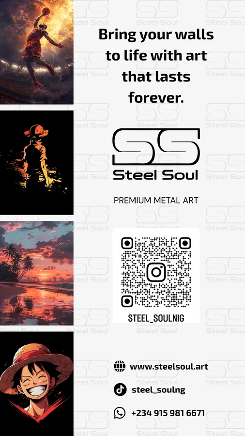
Steel Soul story, original
As madeOff system
Rebuilt · live HTML

Built as a template rather than a file. Swap the four images and the six text blocks and the grid, type scale and single accent hold, so the next twenty posts start consistent instead of being corrected afterwards.

Headline
Cormorant Garamond
Body
DM Sans
Families
Two, the limit
Accent
#667eea, once
Open the template
03 / Approach

Four things worth knowing
before you hire me.

01

I share work early and rough.

Polished reveals waste everyone's week. The feedback that actually changes a design arrives in the first ten minutes of looking at something unfinished, and you only get it if the work is unfinished when you show it.

02

I write the reasoning down.

Every visual decision gets a stated rule. Not because documentation is virtuous, but because a choice nobody can explain gets overturned the first time someone senior dislikes it, and then you are back where you started.

03

I write rules, not moodboards.

A moodboard tells you how something should feel. A rule tells the next person what to do when you are not in the room. One accent per design. Two families, maximum. Constraints narrow enough that doing it right is easier than improvising.

04

I expect to be wrong about some of it.

The first audit I write about any product contains at least one thing the team will correct, because they know things I cannot see from outside. I would rather find that out in week one than defend it into week four.

04 / About

Brands do not fail
at the launch.

PK
Prince Kamsi · Abuja, NG

They fail in the ninetieth application, made by somebody who was not in the room.

I came up through graphics and brand work, and I have owned creative direction on client identities since. What taught me most was not the presentations. It was watching identities I had made get used by other people. A junior laying out a flyer at speed. A client stretching a logo onto a shirt. Somebody reaching for a colour that was never in the palette.

That is where brands actually come apart, and no amount of craft in the original artefact prevents it. So I write systems with constraints in them. One accent per design. Two type families, maximum. A logotype that is never set by hand. Rules narrow enough that doing it correctly is the path of least resistance.

Based in
Abuja, Nigeria
Focus
Identity and brand systems
Download CV
05 / Contact

Open to one
primary engagement.

If your brand has drifted, or never had rules to drift from, that is the problem I enjoy most. Tell me what it is meant to stand for and where it stopped looking like that.

princekammzy@gmail.com
LinkedIn
prince-kamsi
Based in
Abuja, Nigeria
Disciplines
Identity, guidelines, art direction, asset design
Recent
Growy case study